financing platform for small or big projects that benefit a greater cause
hooandja
school project
2024
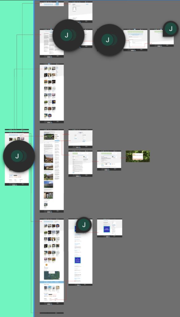
i started my 2nd year of studies with a project that focused on redesigning an aged user interface and user journey. I began by studying the website’s user journey and Ui. i documented my findings and began with the redesign task.
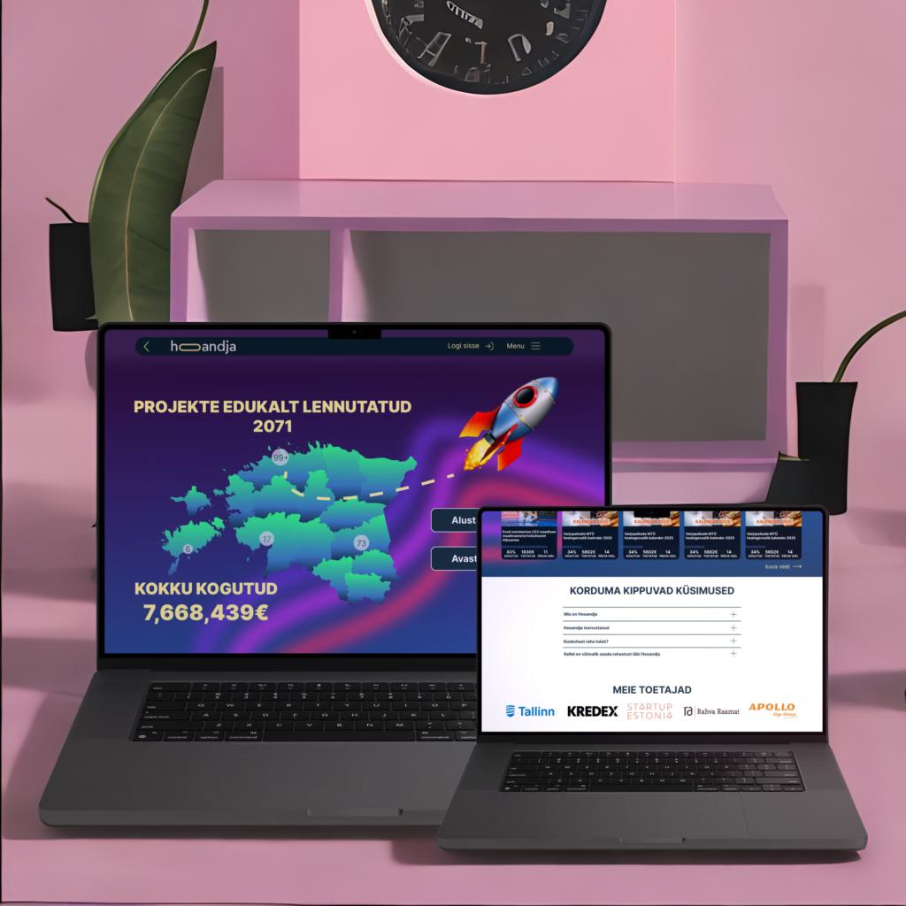
when i think about fundraisers, new ideas and entrepreneurship, i think of gradients and minimalistic visuals. something fresh in the scene of neutral colours that portray years of experience and conservative views.
new ideas are colourful and vibrant and so are the people hosting and supporting them.
im not saying companies with years of experience and well thought out designs are bad. just that fresh projects have more motivation and willpower to launch and take off. hence the choice of colours.
Mapping out all the negatives and painpoints of the current site